Corporate Financial Statements
At a Glance
Visualize income statements as Sankey diagrams
Track cash flow from revenue to net income intuitively
Intuitive Financial Analysis
Instead of complex numbers, understand cash flows visually with Sankey diagrams.
Company Search
Search listed companies and view their financials instantly. Supports KOSPI, KOSDAQ, and KONEX.
Sankey Chart
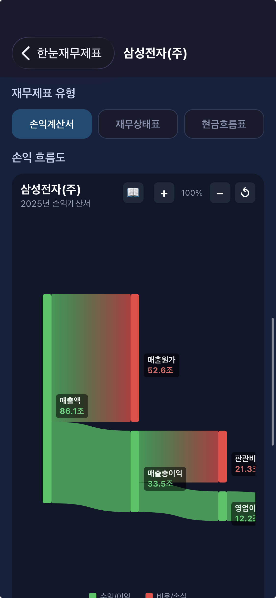
Visualize cash flow from revenue to net income as a Sankey diagram.
Year Comparison
Select from up to 5 years of financial data by year and quarter for comparison.
Financial Glossary
Quickly look up terms like Revenue, Operating Income, and Net Income.
Follow the Money
Analyze corporate revenue structure in 5 stages from revenue to net income.
See It All with Sankey Diagrams
Line width represents the size of each amount.
Green indicates income and profit, red indicates costs and losses.
Income / Profit
Revenue, gross profit, operating income, net income, and other income items are shown in green.
Costs / Losses
COGS, SG&A, taxes, and other expense items are shown in red.
Line Width
Line width is proportional to the amount of each item. Understand proportions intuitively!
Multiple Report Types
From annual reports to quarterly reports, check financial data for any period.
Report Types
Key Financial Items
Perfect For You If...
Stock Investors
Individual investors who want to quickly understand the revenue structure of companies.
Business / Accounting Students
Students who want to deepen their understanding with real corporate financial data.
Corporate Analysts
Professionals who want to intuitively analyze a company's cost structure and profitability.
Finance Beginners
If income statements feel overwhelming, visualization makes them easy to understand.
Personal Finance Enthusiasts
Those who want to verify a company's financial health and make informed investment decisions.
Data Visualization Fans
Those who want to see complex financial data intuitively through Sankey diagrams.
How to Use
Search for a Company
Search for companies you're interested in. Supports all listed companies (KOSPI, KOSDAQ, KONEX).
Select Year & Report
Choose the year and report type (annual, semi-annual, quarterly) from up to 5 years of data.
View Sankey Chart
See the flow from revenue to net income as a Sankey diagram. Pinch to zoom and drag to explore!
Detailed Analysis
Tap each item to see amounts and ratios. A financial glossary is also provided.
Official Data Sources
We provide accurate financial data through the official API of Korea's Financial Supervisory Service (DART).
FSS DART
Data is provided through the official OpenDART API of Korea's Electronic Disclosure System.
Official Disclosure Data
Visualization is based on actual financial statement data disclosed by companies.
Latest Data
The latest financial statements disclosed on DART are retrieved in real-time.
Frequently Asked Questions
What is FinGlance?
FinGlance is an app that visualizes corporate income statements as Sankey diagrams. You can intuitively track the flow from revenue to net income.
Is FinGlance free?
Yes! All core features of FinGlance are completely free to use.
Where does the data come from?
Financial statement data is retrieved through the official OpenDART API of Korea's Financial Supervisory Service (FSS). It is based on actual disclosed financial data.
What is a Sankey diagram?
A Sankey diagram is a visualization technique that represents the size of flows with line width. It intuitively shows how revenue is divided into costs and profits.
Which companies can I look up?
You can look up financial statements for all companies listed on KOSPI, KOSDAQ, and KONEX. Unlisted companies can also be searched if they have disclosed to DART.
Get Started Now
Understand corporate financial statements with Sankey diagrams at a glance